BUENA VISTA MANOR HOUSE 1984
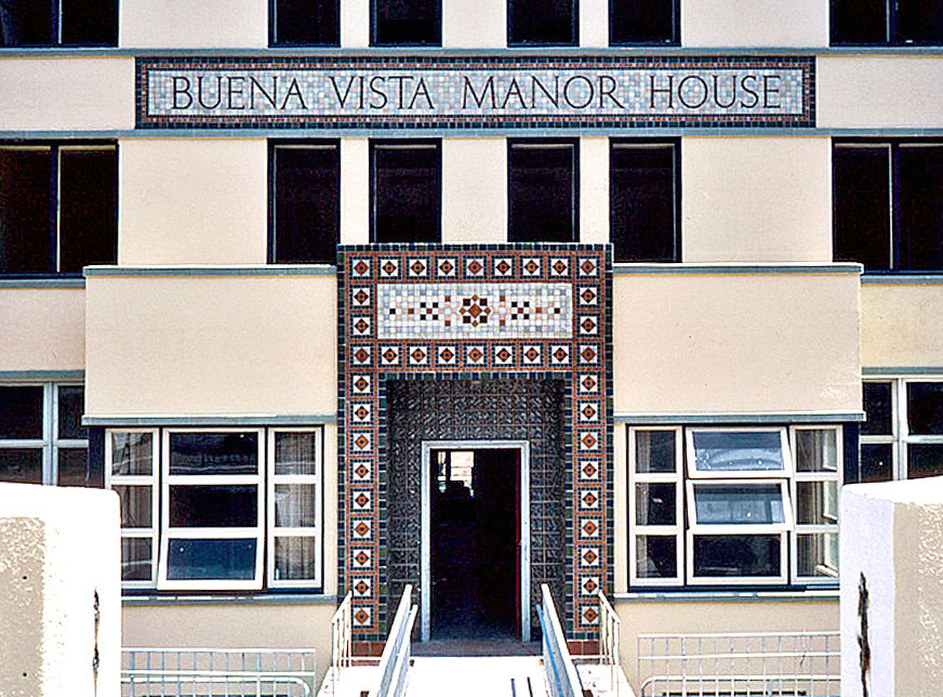
Buena Vista Manor House San Francisco, CA
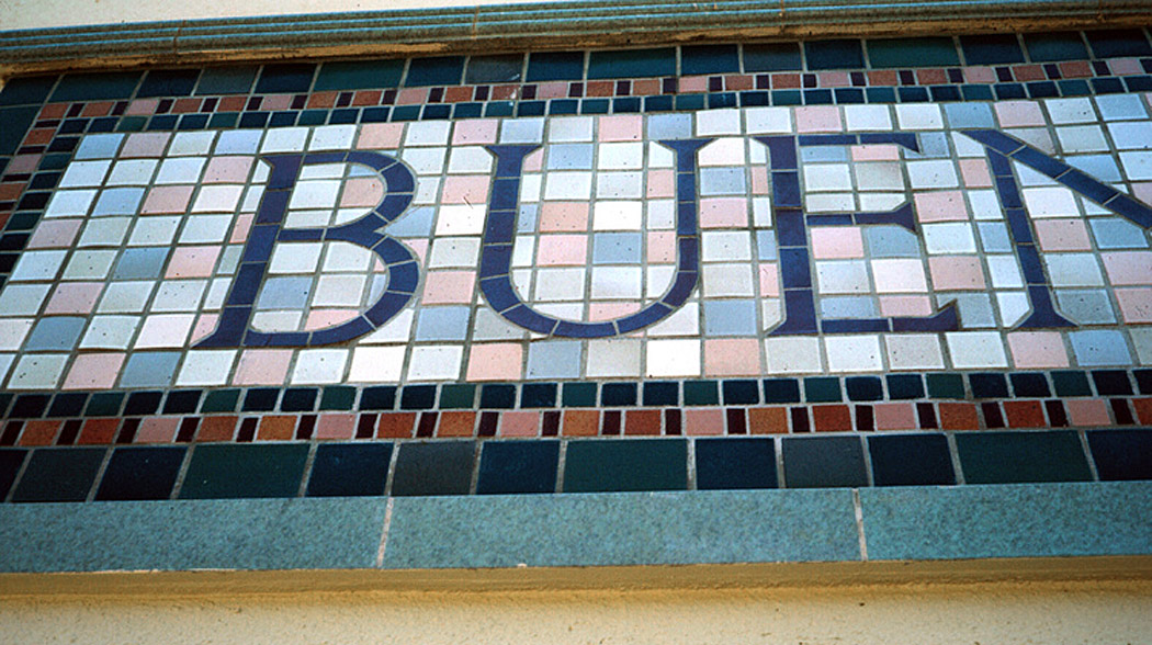

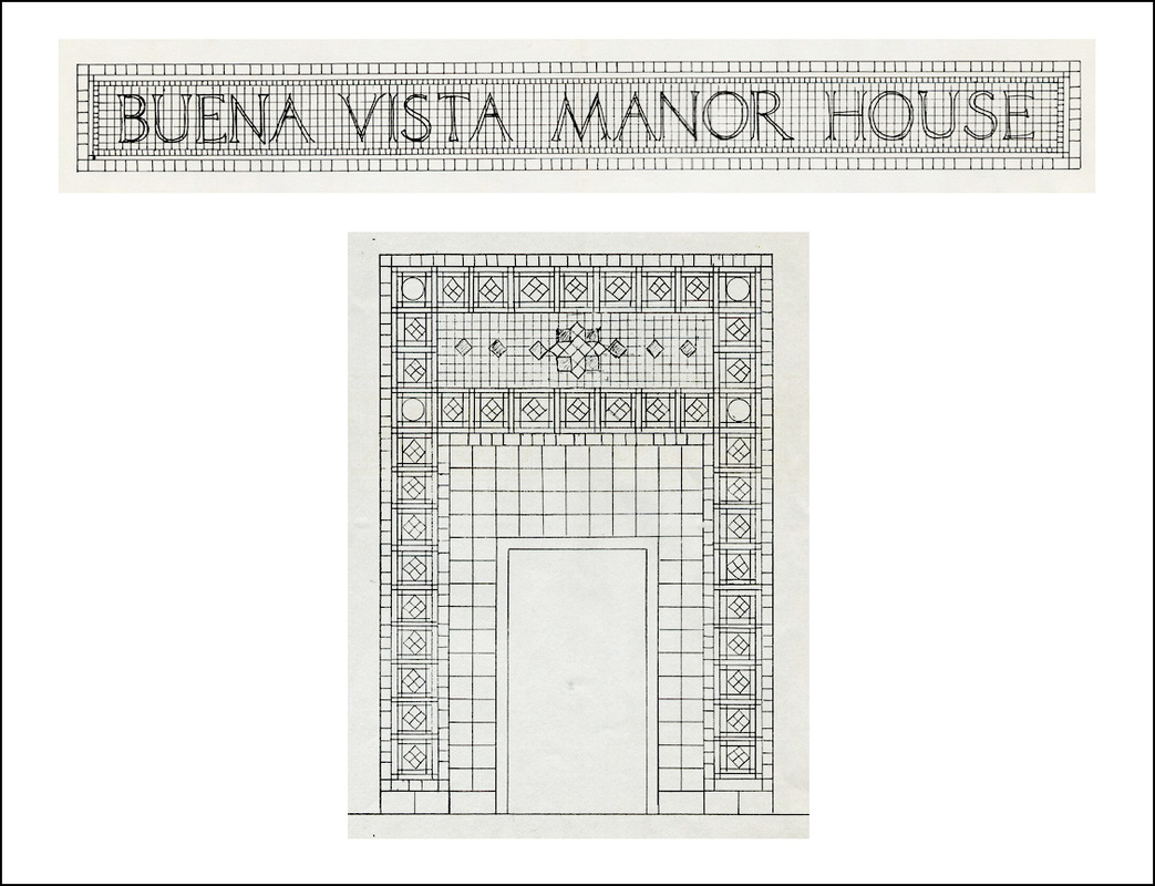
In February 1984 an architect-contractor friend called me about a project he was working on. His client was turning the former Saint Joseph’s School for Nursing on Buena Vista Heights in San Francisco into an assisted living facility. He wanted to cover the sign of incised lettering, some thirty feet long, spelling out Saint Joseph’s College of Nursing above the main entry in over two-foot high Roman lettering. I was to design a mosaic with the new name of the building, BUENA VISTA MANOR HOUSE. I pointed out that “manor house” is redundant (a manor is a house) but that’s the name they wanted, which worked out well because I needed the length of the name to cover the original lettering.
DESIGN
The building was built in 1946 to serve as the nursing school for the adjacent St. Joseph’s Hospital. It featured the period’s glass bricks for the entry and pale green ceramic horizontal trim on the façade.
To go with the new sign I was to design a tiled border for the entrance, with the total color scheme to work with the ceramic trim and the paint chosen for the walls. The sign was the main problem to be solved, but the entry design had to work with it.
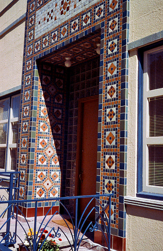
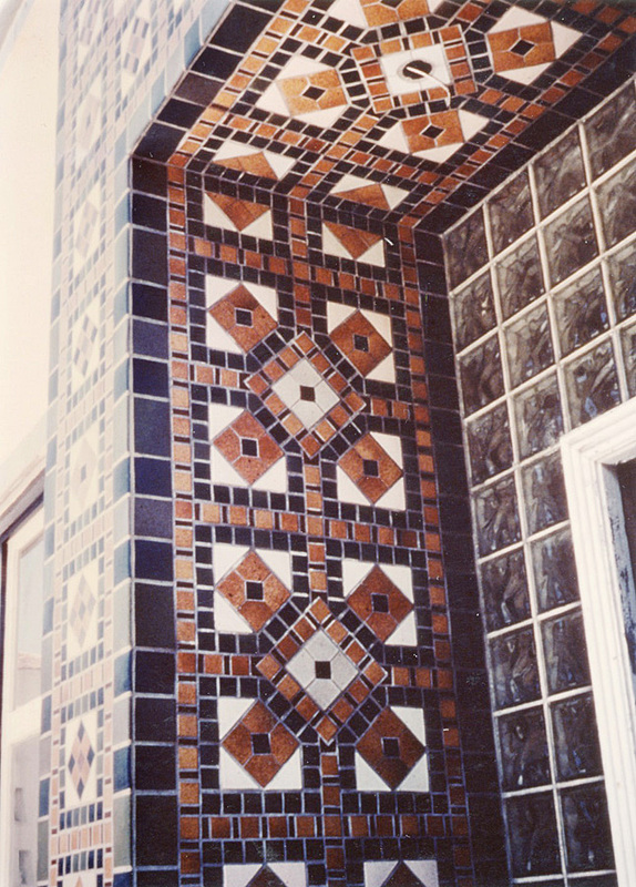
I took the grid of the glass bricks as the basis for the border around the entrance, and designed a repeating pattern of a diamond in a square with a unifying border. The Buena Vista Manor House sign, with its black letters in a light field, got a similar border. The light color of this field is repeated above the entry.
I drew a design and also submitted full-scale sample boards tiled in different color schemes, one of which was selected.
DESIGN
The building was built in 1946 to serve as the nursing school for the adjacent St. Joseph’s Hospital. It featured the period’s glass bricks for the entry and pale green ceramic horizontal trim on the façade.
To go with the new sign I was to design a tiled border for the entrance, with the total color scheme to work with the ceramic trim and the paint chosen for the walls. The sign was the main problem to be solved, but the entry design had to work with it.
I took the grid of the glass bricks as the basis for the border around the entrance, and designed a repeating pattern of a diamond in a square with a unifying border. The Buena Vista Manor House sign, with its black letters in a light field, got a similar border. The light color of this field is repeated above the entry.
I drew a design and also submitted full-scale sample boards tiled in different color schemes, one of which was selected.
FABRICATION
Using pegboards (a ready-made grid) I laid out the designs of all sections for the façade, including the sign, in various colors and sizes of tiles. The only cuts were around the diamond shapes in the border pattern and of course in and around the lettering.
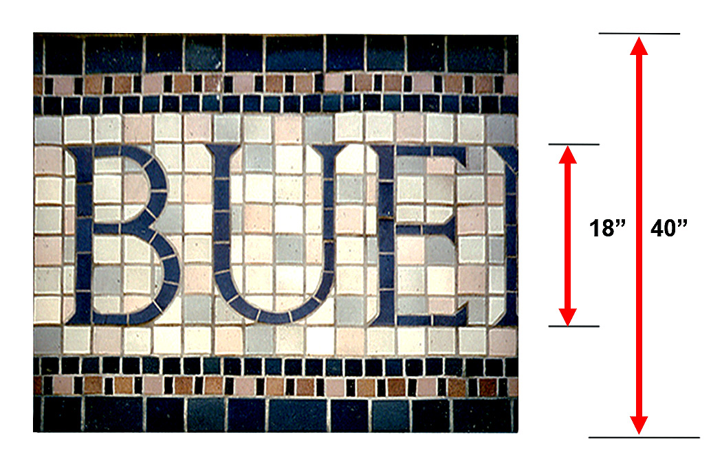
To make the sign, I cut out 18-in.-high letters from black roofing paper. I spelled out BUENA VISTA MANOR HOUSE on the 32-ft. length of four 4 x 8-ft. pegboards laid on the ground in front of my studio. To get the spacing of the letters correct I gauged the layout from the roof, going up and down the ladder and adjusting the letters until all the words looked right. (The trick is to look at three letters at a time, adjusting the middle one so the spaces between the letters look proportionally the same. Different combinations of letters work with different spaces between them. It’s a matter of eyeballing – there is no set spacing.)
Then I outlined the letters onto the pegboards and began the tiling process. I arranged several light colors in a random pattern for the sign’s background, and repeated this design in the light field above the entryway.
I used the same process as with the Clock, facing the tiles with clear tape, cutting them in sections with registration marks and numbers, and packing them in boxes for transport.
INSTALLATION
There were no professional tile setters on this project, so I set the mosaics on all the surfaces myself, using scaffolds provided by the contractor. My inexperience proved costly in time and effort.
The unforeseen problem I ran into had to do with the original incised letters. They were deeply cut, and the mortar I filled them with before setting the mosaic sections onto the surface was too heavy to stay put. The bulky wet mortar leaked out and down and took my tiles with it. And worse, it loosened the clear tape holding the tiles in place.
I had to remove the few sections I had placed before I realized my error, clean and dry them, and re-tape the tiles. Then, after cleaning off the spilled mortar from the wall, I filled in the carved letters, in several stages, letting the mortar set till all indentations were flush with the wall surface. I left them to set overnight.
From then on it was back to the normal process of setting the tile sections onto the flat wall, which went well.
Using pegboards (a ready-made grid) I laid out the designs of all sections for the façade, including the sign, in various colors and sizes of tiles. The only cuts were around the diamond shapes in the border pattern and of course in and around the lettering.
To make the sign, I cut out 18-in.-high letters from black roofing paper. I spelled out BUENA VISTA MANOR HOUSE on the 32-ft. length of four 4 x 8-ft. pegboards laid on the ground in front of my studio. To get the spacing of the letters correct I gauged the layout from the roof, going up and down the ladder and adjusting the letters until all the words looked right. (The trick is to look at three letters at a time, adjusting the middle one so the spaces between the letters look proportionally the same. Different combinations of letters work with different spaces between them. It’s a matter of eyeballing – there is no set spacing.)
Then I outlined the letters onto the pegboards and began the tiling process. I arranged several light colors in a random pattern for the sign’s background, and repeated this design in the light field above the entryway.
I used the same process as with the Clock, facing the tiles with clear tape, cutting them in sections with registration marks and numbers, and packing them in boxes for transport.
INSTALLATION
There were no professional tile setters on this project, so I set the mosaics on all the surfaces myself, using scaffolds provided by the contractor. My inexperience proved costly in time and effort.
The unforeseen problem I ran into had to do with the original incised letters. They were deeply cut, and the mortar I filled them with before setting the mosaic sections onto the surface was too heavy to stay put. The bulky wet mortar leaked out and down and took my tiles with it. And worse, it loosened the clear tape holding the tiles in place.
I had to remove the few sections I had placed before I realized my error, clean and dry them, and re-tape the tiles. Then, after cleaning off the spilled mortar from the wall, I filled in the carved letters, in several stages, letting the mortar set till all indentations were flush with the wall surface. I left them to set overnight.
From then on it was back to the normal process of setting the tile sections onto the flat wall, which went well.